Big Number Chart
When you want to show a single, important value in a clear way
Big number charts are useful to call out single values in a clear and concise way. They are useful when you want to highlight a particular metric, such as revenue or profit, and make it easy to see how that metric has changed over time.
How to configure
Once you've run your query and have your dataset, click the chart button on the query results tab and choose big number chart.
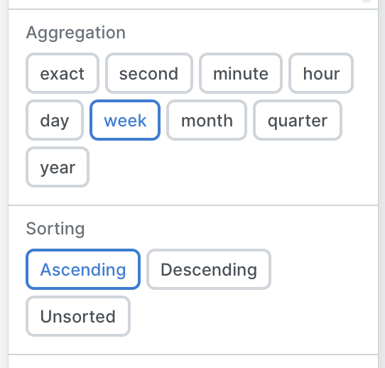
From there, choose the column that has the value you'd like to show, and the column you'd like to trend by. For example if you're tracking the change in number of new customers, pick the count of the new_customers column to show the value, and then trend by the timing for the week. Select how you'd like to aggregate, and how you'd like to sort the data.
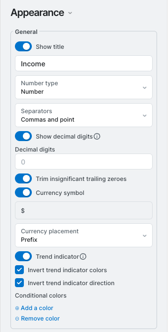
After you have the basic chart set up, you can alter the appearance. Is the number a percentage, a raw value, a currency? Big number charts have the ability to format numbers and labels more extensively than some of the others. Elect if you need commas or decimal points to separate numbers, and if you need to clean up run on data points. Finally, select whether or not to show the trend line below, indicating the way in which the numbers have changed since the last data point. In the event you're showing an income, the appearance tab might look like this:
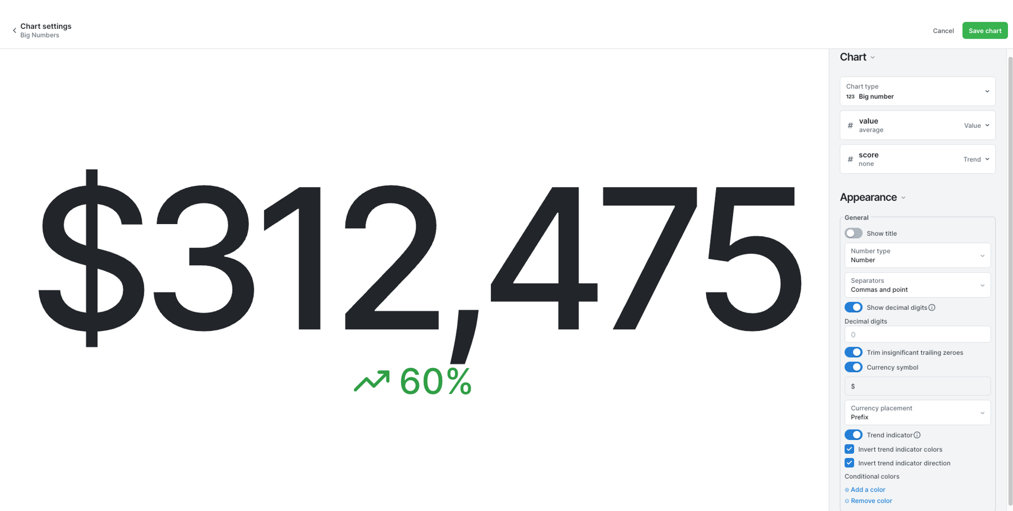
The final product looks like, well, a big number.
Updated 10 months ago