Line Chart
Use line charts to show trends or continuous data.
Line charts are used to illustrate trends and changes in data over a period of time. Line charts can be used to compare multiple datasets since that can be overlaid on top of one another to show the differences between them. To highlight the differences even more, you can fill in the area under each line (see below).
How to create a line chart
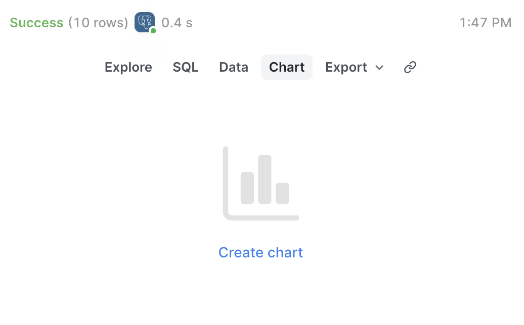
Once you have the query results you want to work with click the button that says Chart and then Create chart.
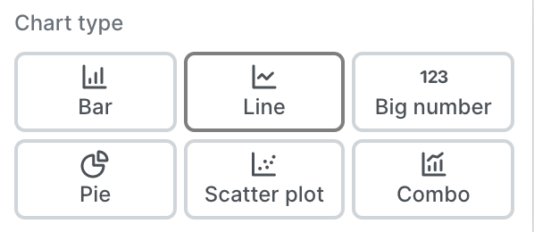
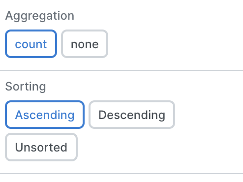
Select Line Chart, and then set the columns you'd like to use for the x and y axes, along with your aggregation and sorting preferences and the color of the lines.
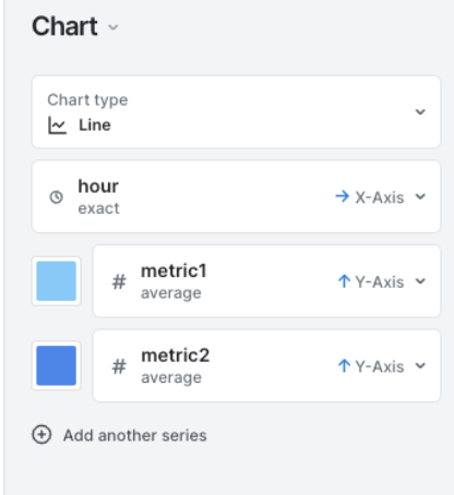
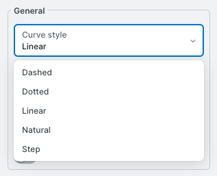
Next, you can set the appearance of the line chart. How do you want the style of the line? What should we do about gaps? Do you want to show labels on data points or axes? Make all these decisions under the Appearance tab.
After making your selections you'll end up with a beautiful line chart that you can add to dashboards, or share with your team!
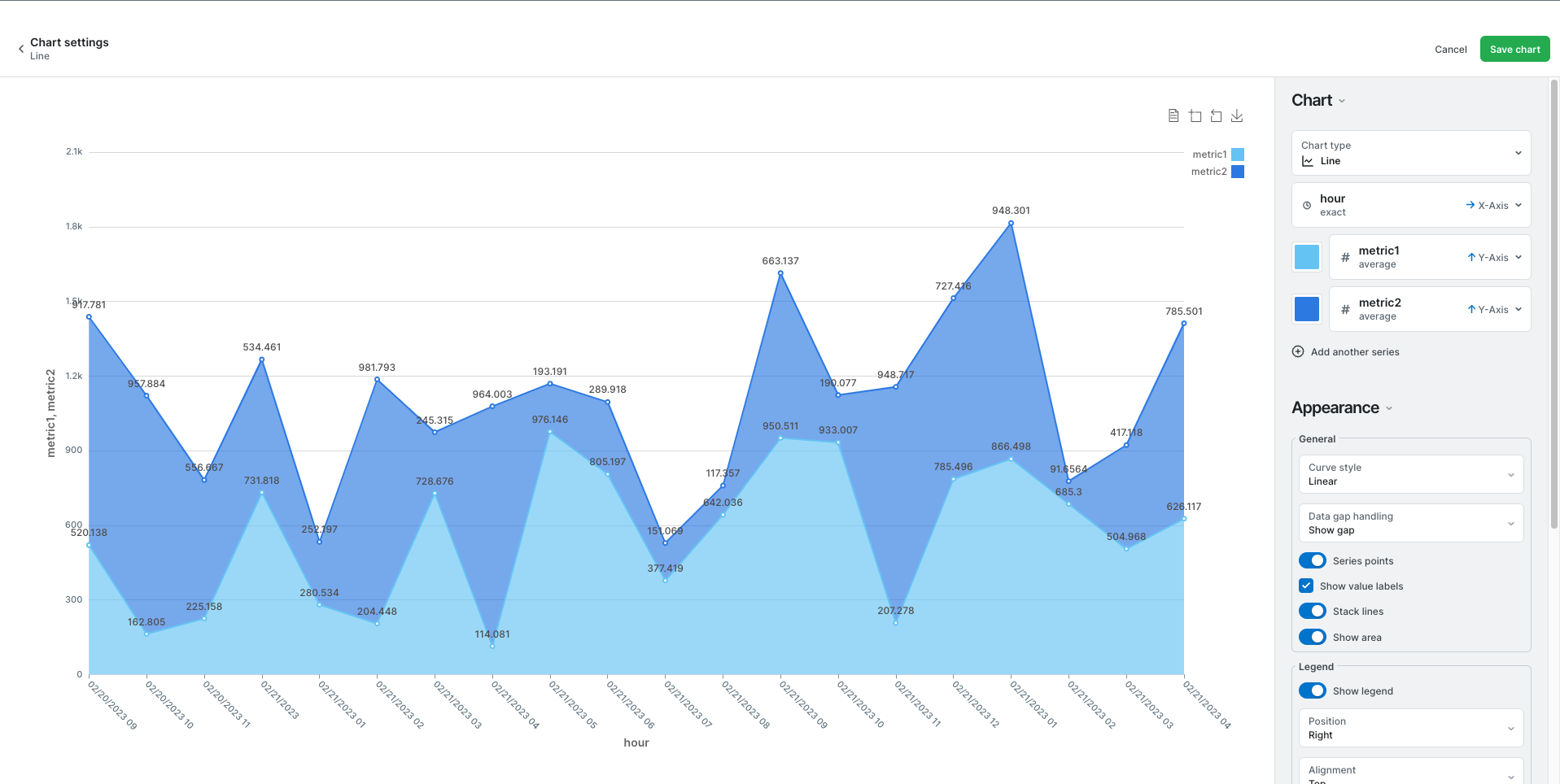
They might look something like this:
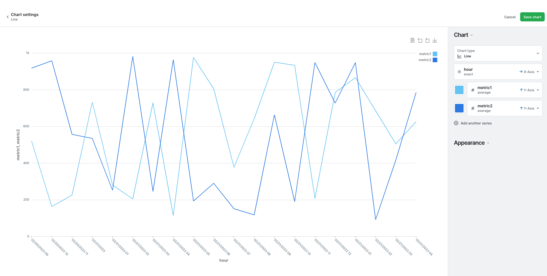
Or this:
Updated 10 months ago