Pie Chart
Break down parts of a whole
Pie charts are best used to show the proportion of different categories within a single data set. They work well when the data can be divided into distinct categories, and when it is important to show the relative sizes of each category. However, they can be difficult to read when there are too many categories, and it can be hard to compare the sizes of the different slices. Regardless, in PopSQL you can format labels and assign colors to the slices of the pie to make it more useful for you.
Configuring your pie chart
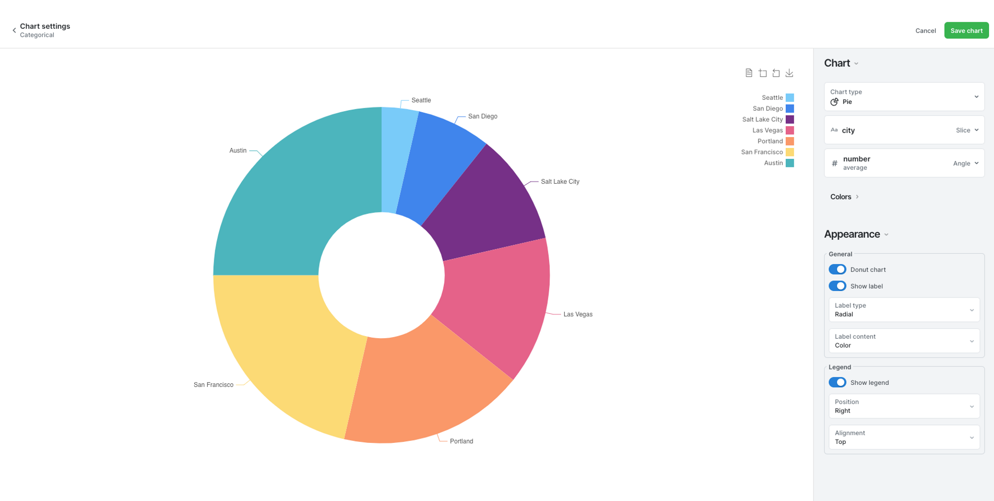
In the below example, we see the differences in the size of the population in major cities in the United States. The cities are configured to be the slices, and population data determines the size. The labels are shown, and the colors for each city are set.
After selecting the pie chart option when building a chart, you can configure the settings as you like. Under the Chart tab, you choose the slice and angle of your data. Which columns represent the categories that fill out your chart, and is it a count or an average? Below, under Appearance, you can choose whether or not there is a donut hole in the middle, and if the labels are shown in the slices, or outside. Finally, choose where to find the legend, if you want to show it at all.
If you are on a business plan, you can customize the default chart colors to match your brand colors.
Updated 10 months ago