Scatter Plot
Identify trends, outliers and other data relations with a scatter plot
Scatter plots are best used to show how two sets of data are related to one another. They are particularly useful for identifying patterns and trends in data, and for determining whether there is a correlation between the two sets of data. Scatter plots can also be used to identify outliers or anomalies in the data, which can be useful for further analysis.
Configuring your scatter plot
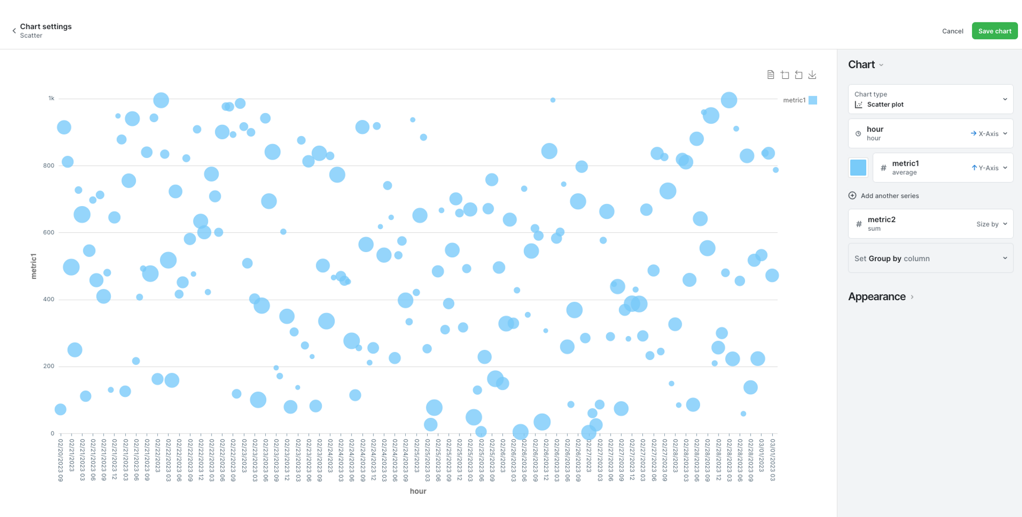
After running your query, create a chart and select "Scatter plot." Then define the x and y-axis values. From there, you can choose the metric that will define the size of the plots, and if you'd like to group the data in a particular way.
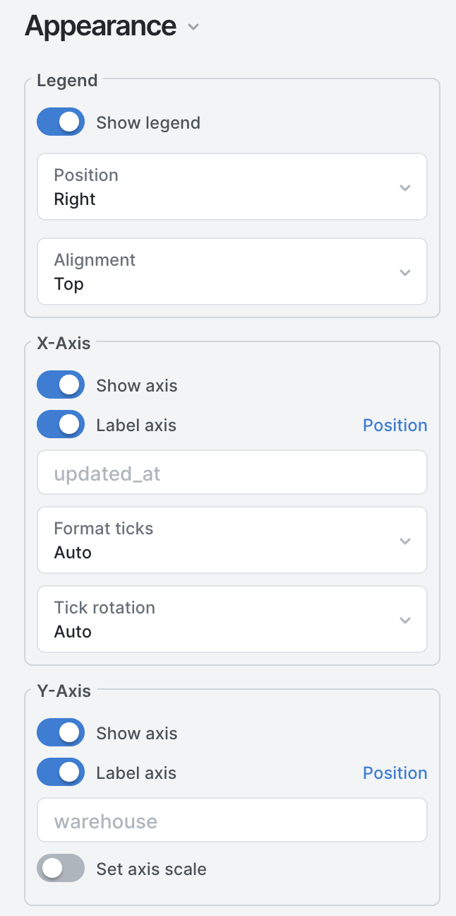
Finally, under the Appearance tab, you can configure the details to your liking. Where do you show the legend, do you show labels, and how the labels look are all settings that can be found under this tab.
Updated 10 months ago