Combo Chart
Combine line, bar, and area charts to show related trends
Combo charts are best used when you want to show two or more different data sets on a single chart. They are particularly useful when you want to show how two data sets are related to one another, or when you want to compare data sets with different units of measurement. For example, you might use a combo chart to show both sales revenue and profit margin for a particular product, with revenue shown as a bar chart and profit margin shown as a line chart. This can help you to see how changes in revenue are related to changes in profit margin over time.
Configuring a combo chart
From the chart menu, select "combo chart," then we can begin constructing the aspects of the chart.
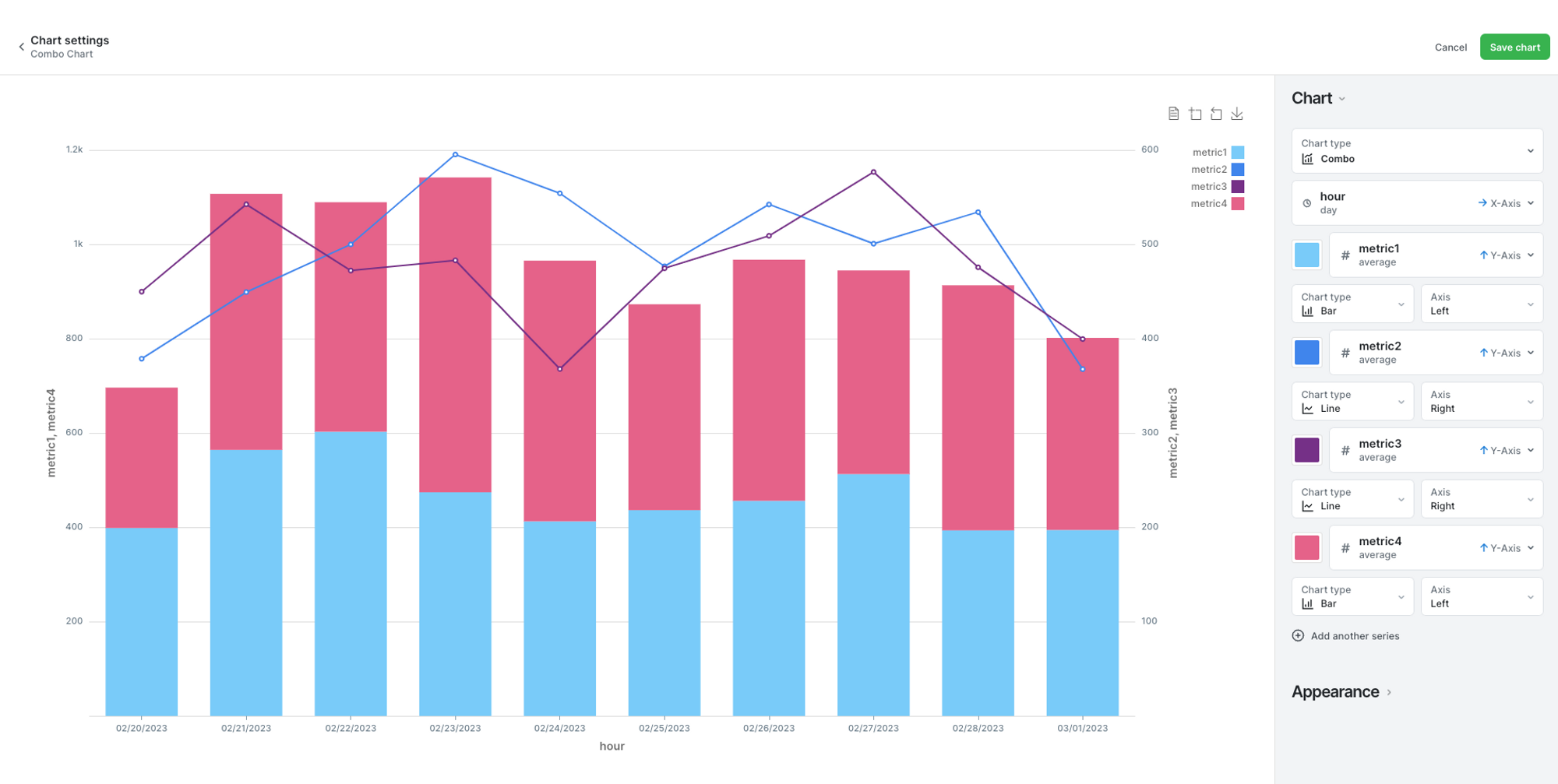
In the example pictured below, the x-axis is showing single days, then the y-axis is stacked with line and bar charts showing 4 different metrics, with their labels on the left and right sides.
To execute a chart like this, select Combo from the list of chart options, and then you can add as many y-axis metrics as you'd like. Define the value, aggregation, and sorting for the x-axis. Then the y-axis values need you to specify column and aggregation, and you can choose to combine a line, bar, or area chart. You can adjust the colors to your liking, and then manage the settings for the labels and legends under the appearance tab.
Updated 10 months ago